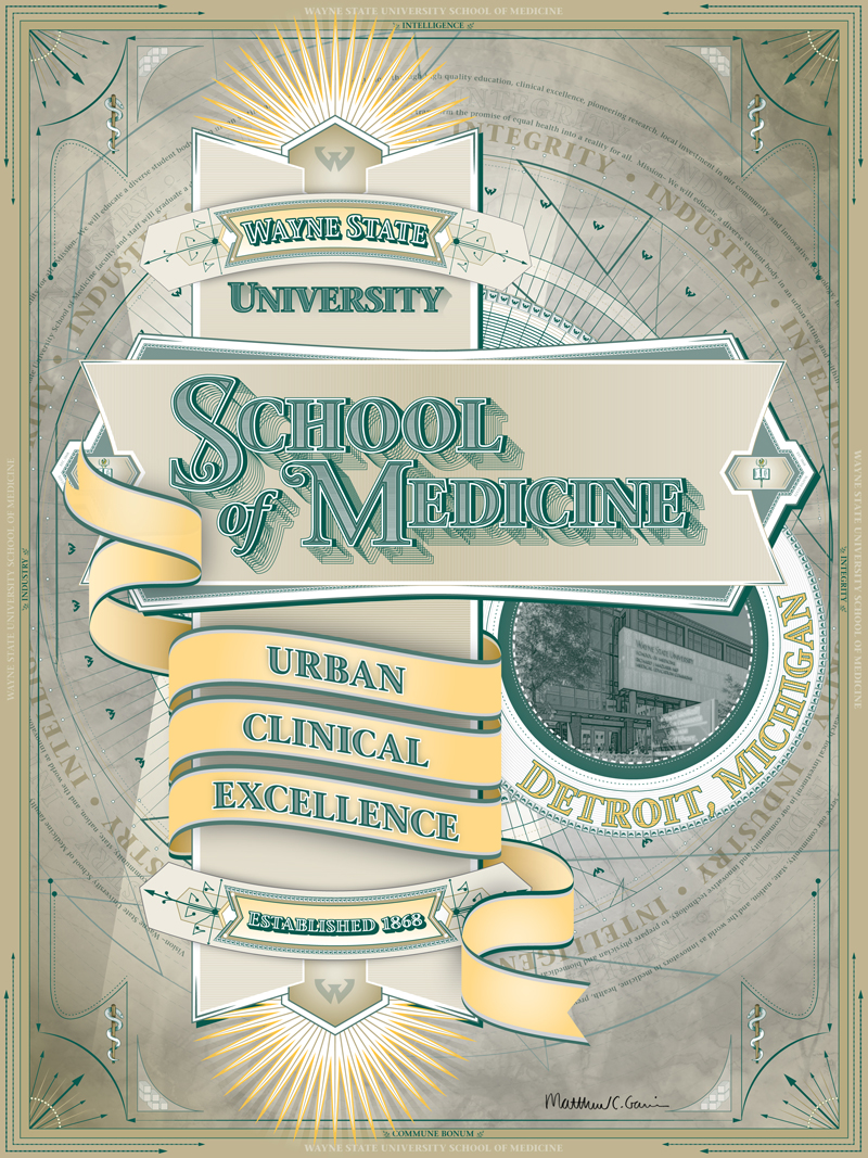
Branding poster
I created this poster for as a part of WSU-SOM branding. I was inspired by the upcoming sesquicentennial in regards to its design and used that as my approach to a unique design and typography. I have always been a a fan of the turn of the century lettering and cartyography while using my interest in the art noveau and De Stjil movements.
- Client: Wayne State University School of Medicine
- Materials and methods: Adobe Illustrator, printed on 18"x24" archival semi-gloss paper
Visual expression
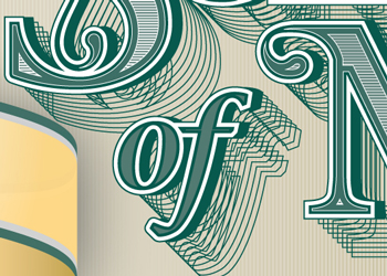
My approach to the layout was analytical, its important to research and understand the visual vocabulary when creating a design. Using the WSU-SOM official university typeface, Stone Serif, I began to stylize the letterforms and paid close attention to detail to achieve a rich aesthetic work of art.